


Two of the Netherlands biggest animation festivals were joining forces
and needed a new name, logo and identity.
and needed a new name, logo and identity.
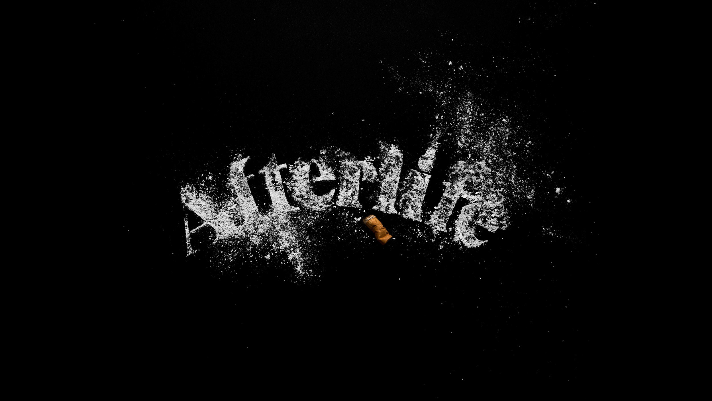
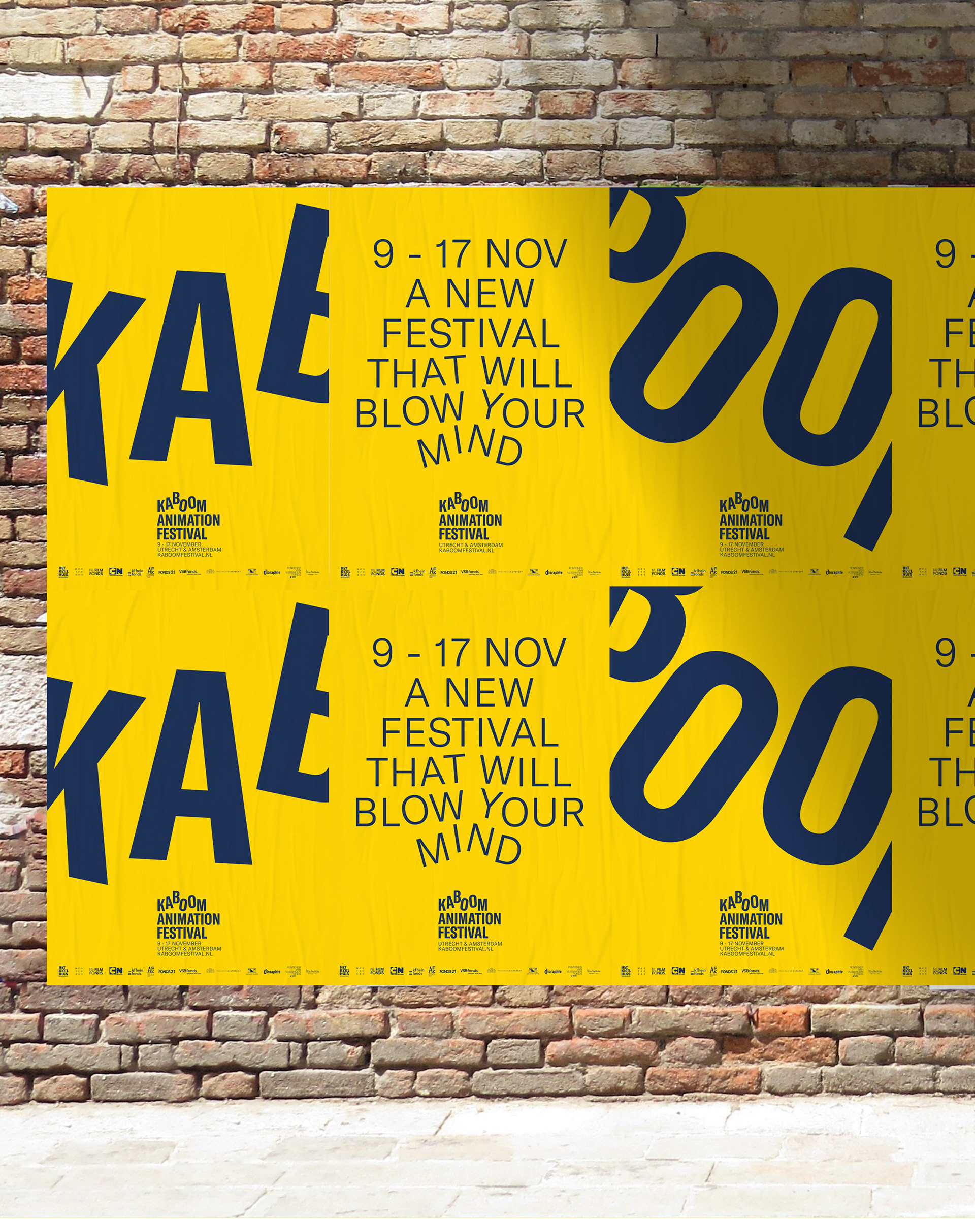
Kaboom animation festival
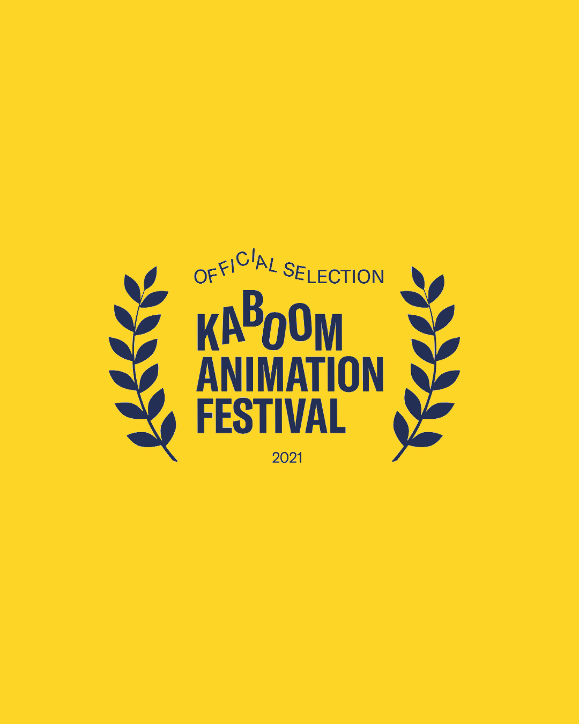
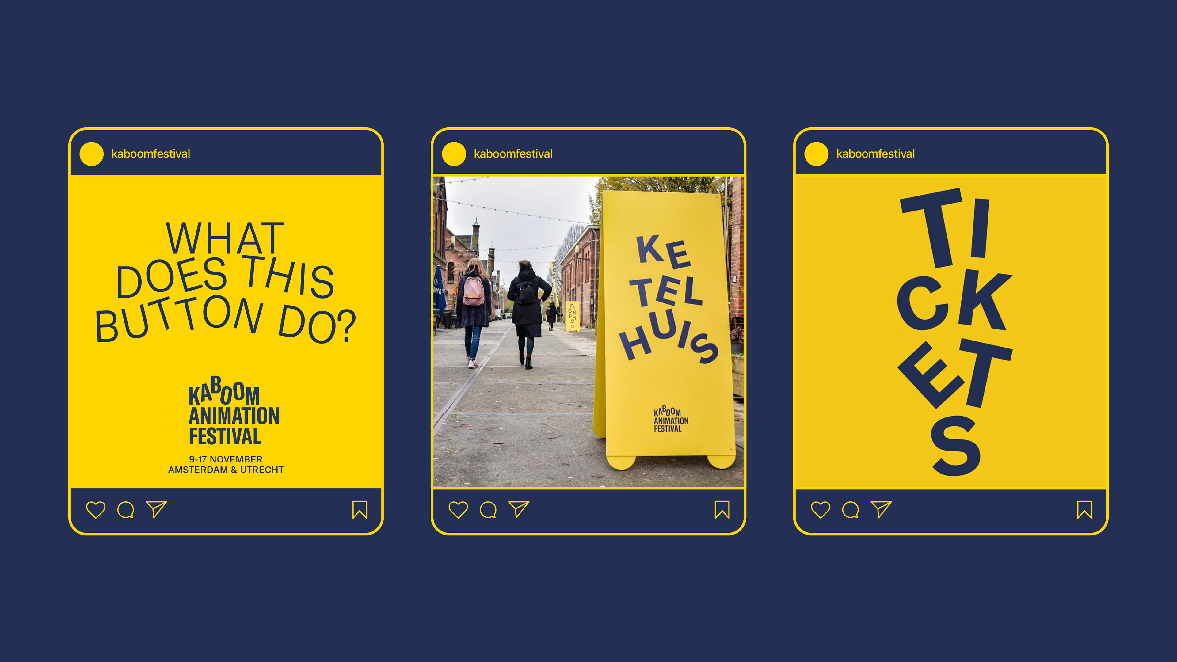
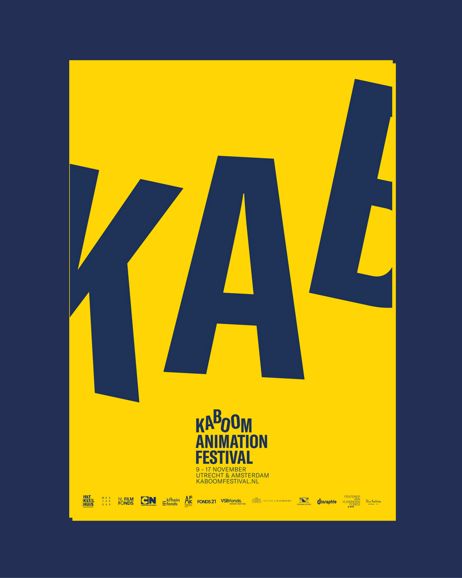
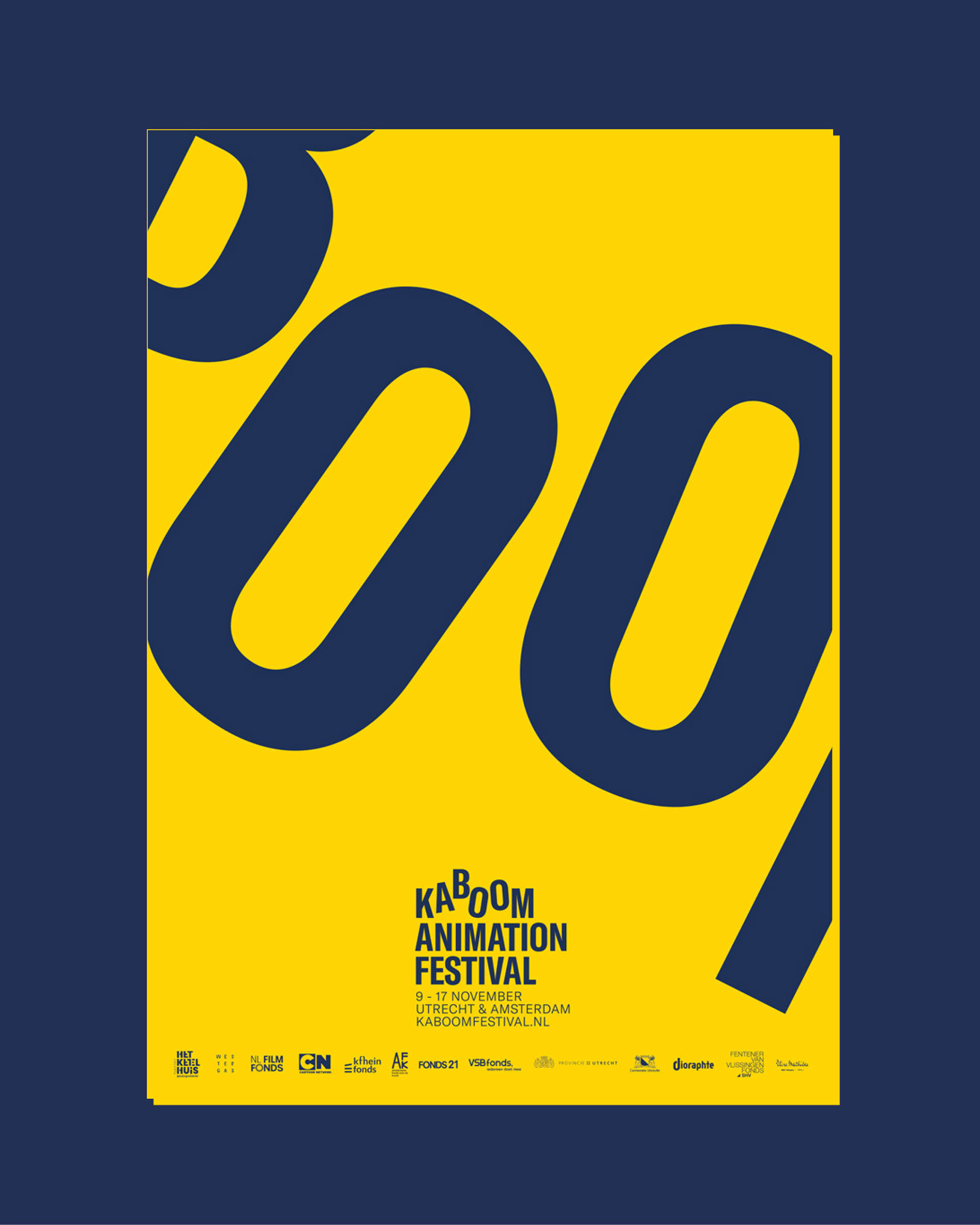
There are two sides to an explosion: The more immediate blast, the tension, the fun. And then comes the shockwaves, the impact. Playful AND smart. We incorporated the movement of a blast into the lettering of the logo and identity text. This stands for impact and energy - we reinforced that by using a clean, bold type with a playful character that keeps the audience engaged with the feeling behind the name.
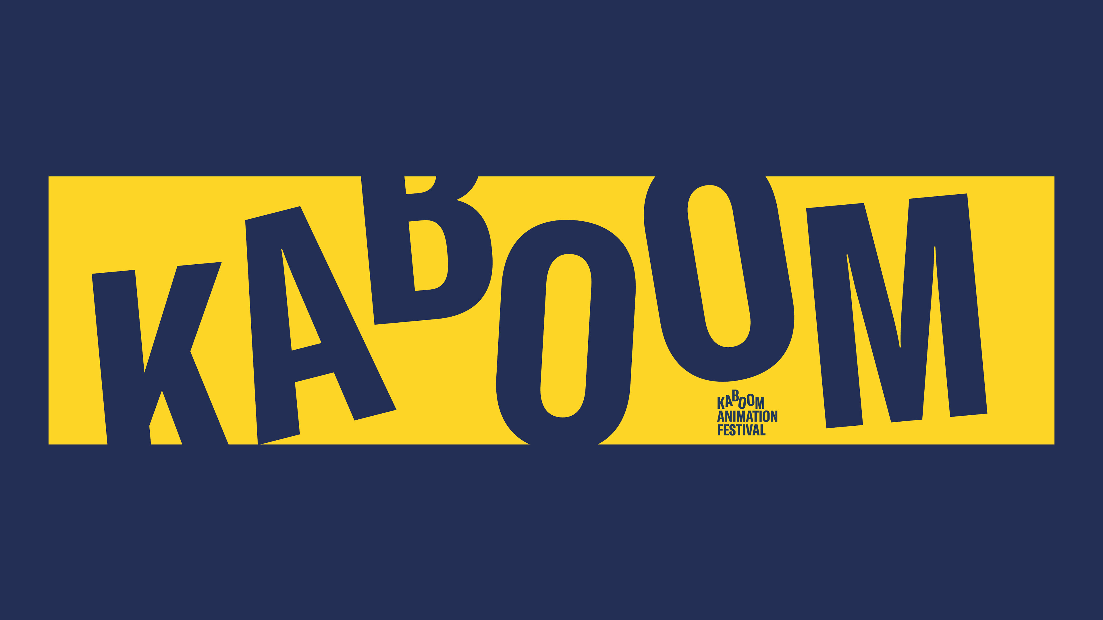


Agency: KesselsKramer with Gijs van den Berg